

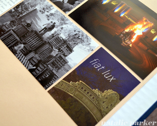
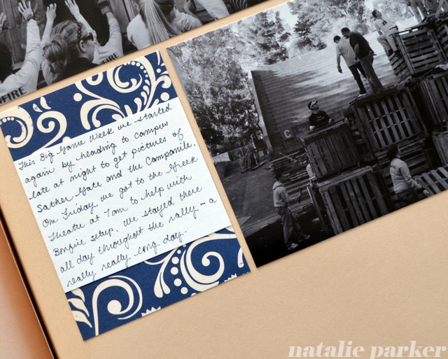
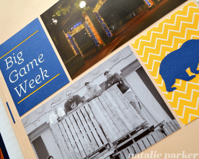
The Story: This is the big rivalry week at my alma mater. Mr. P and I participate in some activities and go back to help the students with the bonfire rally.
Project Life Style: Noticing a pattern? I was hit hard by Project Life inspiration recently. You don’t have to do Project Life to use its ideas. I like that it’s given me a new way to think about displaying a lot of items at once. Here, I was going to do three rows per page but settled on two when I counted up the number of pictures + ephemera.
Black & White + Color: I can’t believe this worked out so well. Truly. It’s like I planned it that way. Usually I go uniformly one way or the other but the mix really works here. Expanding my style again!
Trimmed Ephemera: In order for this design to work, I had to be okay trimming down ephemera to fit the space. I won’t do that all the time but it was no problem here.
Negative Space: What I really like about experimenting with Project Life design is flexing my design muscle when it comes to headlines. You won’t see anything like this in my previous books.
Previously: I’ve scrapbooked Big Game Week for a few years now, each one of them different: 2003 (still a student), 2004 (layouts here and here) , and 2005 (layouts here and here).


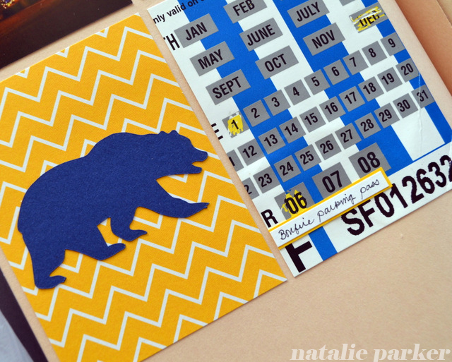
Fonts: Klinic Slab (headline) | Tools: Silhouette SD (headline, bear), Epson Stylus R2000 (photos) | Supplies: Pioneer SJ-100 Jumbo Scrapbook (scrapbook & pages), Epson Semigloss Photo Paper (photos) | Ephemera Included: parking pass, postcard.

I love the fact that you have so much white space in your designs. It really makes me focus on the well edited selection of photos and ephemera. Very cool.
Thanks! I don’t see a blank space as something that has to be filled. Rather, I go with whatever works for the photos/story.