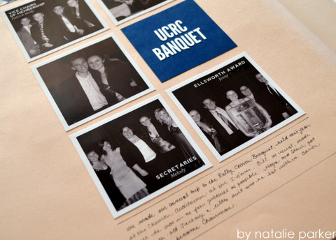
The Story: Mr. P and I attending the annual banquet for the student group we were a part of in college.
Black and White Squares: More squares. I love squares, don’t you? I changed the photos black and white here to make them more cohesive. I usually don’t do that but the color in the photo wasn’t telling the story here. I felt like taking the color away helps focus on the people in the pictures more.
Lots of Group Shots: It’s challenging to make a layout out of a ton of group shots. I think I did pretty well here.
Previously: My 2004 layout for this banquet, my senior year layout for this banquet.
Fonts: Bebas (headline) Nevis (photo caption), Cambria (photo caption) | Tools: Epson Stylus R2000 (photos), Silhouette SD (headline) | Supplies: October Afternoon/Woodland Park/Minnow Creek (patterned paper)


Yes, yes and yes! I find that so much color often takes away from the story. Mostly at parties and other events when there are lots and lots of people. I often do the B&W thing with party photos. If it’s a wedding reception or b-day party I often will make the honorees the only color photo on a page. Beautiful job!!
I’ll have to keep that in mind the next time I scrapbook a wedding!
I couldn’t agree more! The big group shots can be really hard to work with, when everyone is wearing competing colors. Love what you did here and you kept it very cohesive by keeping all the photos the same size and lining them up. Love a order of a grid! 🙂
Thanks! I’ll say again that it’s lovely seeing you around now 🙂
Yay! Still would like that baby back. 😉